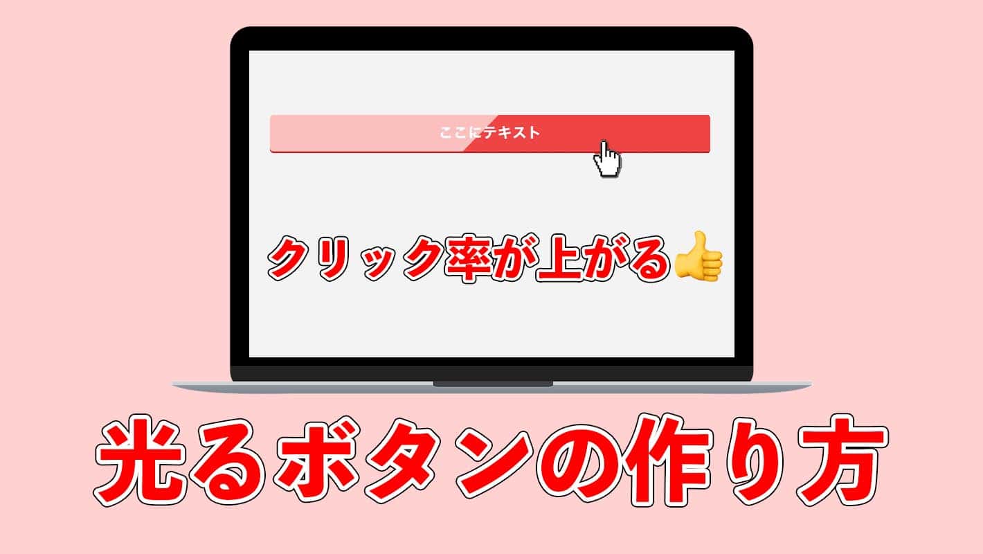
今回はWordPressテーマ「AFFINGER5」風のキラッと光るボタンをCSSだけで作る方法を紹介します。
他にもいくつかパターンを用意したので、気に入ったのがあったら持って帰ってください。コピペ自由です。
光るボタンのCSSコード
先にコードだけ載せておきます。
作り方の解説は後述します。
色などのカスタマイズに関してはCSSコードにコメントを残しておくので参考にしてください。
ボタン風のデザイン
シンプルで厚みのあるボタン風のデザインです。色々なサイトで見かけますね。
<a href="リンク先のURL" class="shiny-btn1">ここにテキスト</a>.shiny-btn1 {
display: block;
position: relative;
width: 80%;/*ボタンの幅*/
padding: 10px 0;
margin: 30px auto;
background-color: #ed4545;/*ボタンの色*/
box-shadow: 0 3px 0 0 rgba(198, 39, 39, 1);/*影の色(rgbaの値を変更)*/
border-radius: 5px;
font-weight: bold;
font-size: 18px;
color: #fff;
text-align: center;
text-decoration: none;
overflow: hidden;
}
.shiny-btn1:hover {
text-decoration: none;
color: #fff;
}
.shiny-btn1::before {
position: absolute;
content: '';
display: inline-block;
top: -180px;
left: 0;
width: 30px;
height: 100%;
background-color: #fff;
animation: shiny-btn1 3s ease-in-out infinite;
}
@-webkit-keyframes shiny-btn1 {
0% { -webkit-transform: scale(0) rotate(45deg); opacity: 0; }
80% { -webkit-transform: scale(0) rotate(45deg); opacity: 0.5; }
81% { -webkit-transform: scale(4) rotate(45deg); opacity: 1; }
100% { -webkit-transform: scale(50) rotate(45deg); opacity: 0; }
}
マウスホバーで凹むボタン
マウスがホバーするとボタンが凹みます。これもよく見かけるデザインですね。
<a href="リンク先のURL" class="shiny-btn2">ここにテキスト</a>.shiny-btn2 {
display: block;
position: relative;
width: 80%;/*ボタンの幅*/
padding: 10px 0;
margin: 30px auto;
background-color: #ed4545;/*ボタンの色*/
box-shadow: 0 3px 0 0 rgba(198, 39, 39, 1);/*影の色(rgbaの値を変更)*/
border-radius: 5px;
font-weight: bold;
font-size: 18px;
color: #fff;
text-align: center;
text-decoration: none;
overflow: hidden;
}
.shiny-btn2:hover {
text-decoration: none;
color: #fff;
box-shadow: none;
-webkit-transform: translateY(3px);
}
.shiny-btn2::before {
position: absolute;
content: '';
display: inline-block;
top: -180px;
left: 0;
width: 30px;
height: 100%;
background-color: #fff;
transition: 0.2s
animation: shiny-btn2 3s ease-in-out infinite;
}
@-webkit-keyframes shiny-btn2 {
0% { -webkit-transform: scale(0) rotate(45deg); opacity: 0; }
80% { -webkit-transform: scale(0) rotate(45deg); opacity: 0.5; }
81% { -webkit-transform: scale(4) rotate(45deg); opacity: 1; }
100% { -webkit-transform: scale(50) rotate(45deg); opacity: 0; }
}
マウスホバーで色が淡くなるボタン
マウスがホバーするとボタンの色が淡くなります。ボタンがリンク先だということがわかりやすいと思います。
<a href="リンク先のURL" class="shiny-btn3">ここにテキスト</a>.shiny-btn3 {
display: block;
position: relative;
width: 80%;/*ボタンの幅*/
padding: 10px 0;
margin: 30px auto;
background-color: #ed4545;/*ボタンの色*/
box-shadow: 0 3px 0 0 rgba(198, 39, 39, 1);/*影の色(rgbaの値を変更)*/
border-radius: 5px;
font-weight: bold;
font-size: 18px;
color: #fff;
text-align: center;
text-decoration: none;
overflow: hidden;
}
.shiny-btn3:hover {
text-decoration: none;
color: #fff;
opacity: 0.7;
}
.shiny-btn3::before {
position: absolute;
content: '';
display: inline-block;
top: -180px;
left: 0;
width: 30px;
height: 100%;
background-color: #fff;
animation: shiny-btn3 3s ease-in-out infinite;
}
@-webkit-keyframes shiny-btn3 {
0% { -webkit-transform: scale(0) rotate(45deg); opacity: 0; }
80% { -webkit-transform: scale(0) rotate(45deg); opacity: 0.5; }
81% { -webkit-transform: scale(4) rotate(45deg); opacity: 1; }
100% { -webkit-transform: scale(50) rotate(45deg); opacity: 0; }
}
マウスホバーでボタンが凹む+淡くなる
上の2つを合わせてみました。人によっては少し華美に感じるかもしれません…
<a href="リンク先のURL" class="shiny-btn4">ここにテキスト</a>.shiny-btn4 {
display: block;
position: relative;
width: 80%;/*ボタンの幅*/
padding: 10px 0;
margin: 30px auto;
background-color: #ed4545;/*ボタンの色*/
box-shadow: 0 3px 0 0 rgba(198, 39, 39, 1);/*影の色(rgbaの値を変更)*/
border-radius: 5px;
font-weight: bold;
font-size: 18px;
color: #fff;
text-align: center;
text-decoration: none;
overflow: hidden;
transition: 0.2s;
}
.shiny-btn4:hover {
text-decoration: none;
color: #fff;
opacity: 0.7;
box-shadow: none;
-webkit-transform: translateY(3px);
}
.shiny-btn4::before {
position: absolute;
content: '';
display: inline-block;
top: -180px;
left: 0;
width: 30px;
height: 100%;
background-color: #fff;
animation: shiny-btn4 3s ease-in-out infinite;
}
@-webkit-keyframes shiny-btn4 {
0% { -webkit-transform: scale(0) rotate(45deg); opacity: 0; }
80% { -webkit-transform: scale(0) rotate(45deg); opacity: 0.5; }
81% { -webkit-transform: scale(4) rotate(45deg); opacity: 1; }
100% { -webkit-transform: scale(50) rotate(45deg); opacity: 0; }
}
マウスホバーで浮き上がるボタン
ボタンに影をつけてみました。マウスがホバーすると浮き上がるようなボタンです。
<a href="リンク先のURL" class="shiny-btn5">ここにテキスト</a>.shiny-btn5 {
display: block;
position: relative;
width: 80%;/*ボタンの幅*/
padding: 10px 0;
margin: 30px auto;
background-color: #ed4545;/*ボタンの色*/
box-shadow: 0 3px 0 0 rgba(198, 39, 39, 1);/*影の色(rgbaの値を変更)*/
border-radius: 5px;
font-weight: bold;
font-size: 18px;
color: #fff;
text-align: center;
text-decoration: none;
overflow: hidden;
transition: 0.2s;
}
.shiny-btn5:hover {
text-decoration: none;
color: #fff;
box-shadow: 0 3px 0 0 rgba(198, 39, 39, 1), 0 8px 15px 0px rgba(0, 0, 0, 0.4);
}
.shiny-btn5::before {
position: absolute;
content: '';
display: inline-block;
top: -180px;
left: 0;
width: 30px;
height: 100%;
background-color: #fff;
animation: shiny-btn5 3s ease-in-out infinite;
}
@-webkit-keyframes shiny-btn5 {
0% { -webkit-transform: scale(0) rotate(45deg); opacity: 0; }
80% { -webkit-transform: scale(0) rotate(45deg); opacity: 0.5; }
81% { -webkit-transform: scale(4) rotate(45deg); opacity: 1; }
100% { -webkit-transform: scale(50) rotate(45deg); opacity: 0; }
}
グラデーションをかけたボタン
少しわかりづらいかもしれませんが、グラデーションをかけてより立体的にしてみました。よりボタンらしい質感が出ていると思います。
ホバーした時のボタンが押し込まれる動作や、色が淡くなるのを消したい人はカスタマイズ方を後述します。
<a href="リンク先のURL" class="shiny-btn6">ここにテキスト</a>.shiny-btn6 {
display: block;
position: relative;
width: 80%;/*ボタンの幅*/
padding: 10px 0;
margin: 30px auto;
background: -webkit-linear-gradient(#ef6c6c, #ed4545);/*ボタンの色*/
box-shadow: 0 3px 0 0 rgba(198, 39, 39, 1);/*影の色(rgbaの値を変更)*/
border-radius: 5px;
font-weight: bold;
font-size: 18px;
color: #fff;
text-align: center;
text-decoration: none;
overflow: hidden;
transition: 0.2s;
}
.shiny-btn6:hover {
text-decoration: none;
color: #fff;
opacity: 0.7;/*不透明度*/
box-shadow: none;
-webkit-transform: translateY(3px);
}
.shiny-btn6::before {
position: absolute;
content: '';
display: inline-block;
top: -180px;
left: 0;
width: 30px;
height: 100%;
background-color: #fff;
animation: shiny-btn6 3s ease-in-out infinite;
}
@-webkit-keyframes shiny-btn6 {
0% { -webkit-transform: scale(0) rotate(45deg); opacity: 0; }
80% { -webkit-transform: scale(0) rotate(45deg); opacity: 0.5; }
81% { -webkit-transform: scale(4) rotate(45deg); opacity: 1; }
100% { -webkit-transform: scale(50) rotate(45deg); opacity: 0; }
}
アイコンをつけたボタン
文字の最後にアイコンをつけてクリックを促すようなボタンです。
Font Awesomeのアイコンを使うので、このボタンを使用する際はテーマの<head>に以下のコードをコピペしてください。すでに入っている人は不要です。
<link rel="stylesheet" href="https://use.fontawesome.com/releases/v5.1.0/css/all.css" integrity="sha384-lKuwvrZot6UHsBSfcMvOkWwlCMgc0TaWr+30HWe3a4ltaBwTZhyTEggF5tJv8tbt" crossorigin="anonymous">
<a href="リンク先のURL" class="shiny-btn8">ここにテキスト</a>.shiny-btn8 {
display: block;
position: relative;
width: 80%;/*ボタンの幅*/
padding: 10px 0;
margin: 30px auto;
background-color: #ed4545;/*ボタンの色*/
box-shadow: 0 3px 0 0 rgba(198, 39, 39, 1);/*影の色(rgbaの値を変更)*/
border-radius: 5px;
font-weight: bold;
font-size: 18px;
color: #fff;
text-align: center;
text-decoration: none;
overflow: hidden;
transition: 0.2s;
}
.shiny-btn8:hover {
text-decoration: none;
color: #fff;
opacity: 0.7;
box-shadow: none;
-webkit-transform: translateY(3px);
}
.shiny-btn8::before {
position: absolute;
content: '';
display: inline-block;
top: -180px;
left: 0;
width: 30px;
height: 100%;
background-color: #fff;
animation: shiny-btn8 3s ease-in-out infinite;
}
.shiny-btn8::after {
content: "\f054";
font-family: 'Font Awesome 5 Free';
font-size: 18px;
font-weight: bold;
margin-left: 0.5em;
}
@-webkit-keyframes shiny-btn8 {
0% { -webkit-transform: scale(0) rotate(45deg); opacity: 0; }
80% { -webkit-transform: scale(0) rotate(45deg); opacity: 0.5; }
81% { -webkit-transform: scale(4) rotate(45deg); opacity: 1; }
100% { -webkit-transform: scale(50) rotate(45deg); opacity: 0; }
}
横が丸角のボタン
両端の角を丸めたボタンです。
<a href="リンク先のURL" class="shiny-btn9">ここにテキスト</a>.shiny-btn9 {
display: block;
position: relative;
width: 80%;/*ボタンの幅*/
padding: 10px 0;
margin: 30px auto;
background-color: #ed4545;/*ボタンの色*/
box-shadow: 0 3px 0 0 rgba(198, 39, 39, 1);/*影の色(rgbaの値を変更)*/
border-radius: 25px;
font-weight: bold;
font-size: 18px;
color: #fff;
text-align: center;
text-decoration: none;
overflow: hidden;
transition: 0.2s;
}
.shiny-btn9:hover {
text-decoration: none;
color: #fff;
opacity: 0.7;
box-shadow: none;
-webkit-transform: translateY(3px);
}
.shiny-btn9::before {
position: absolute;
content: '';
display: inline-block;
top: -180px;
left: 0;
width: 30px;
height: 100%;
background-color: #fff;
animation: shiny-btn9 3s ease-in-out infinite;
}
@-webkit-keyframes shiny-btn9 {
0% { -webkit-transform: scale(0) rotate(45deg); opacity: 0; }
80% { -webkit-transform: scale(0) rotate(45deg); opacity: 0.5; }
81% { -webkit-transform: scale(4) rotate(45deg); opacity: 1; }
100% { -webkit-transform: scale(50) rotate(45deg); opacity: 0; }
}
フラットなデザインのボタン
優しいイメージのフラットなボタンにしてみました。ブログによってはよく合いそうです。
<a href="リンク先のURL" class="shiny-btn7">ここにテキスト</a>.shiny-btn7 {
display: block;
position: relative;
width: 80%;/*ボタンの幅*/
padding: 10px 0;
margin: 30px auto;
background-color: #f2888d;/*ボタンの色*/
border-radius: 5px;
font-weight: bold;
font-size: 18px;
color: #fff;
text-align: center;
text-decoration: none;
overflow: hidden;
transition: 0.2s;
}
.shiny-btn7:hover {
text-decoration: none;
color: #fff;
opacity: 0.7;
}
.shiny-btn7::before {
position: absolute;
content: '';
display: inline-block;
top: -180px;
left: 0;
width: 30px;
height: 100%;
background-color: #fff;
animation: shiny-btn7 3s ease-in-out infinite;
}
@-webkit-keyframes shiny-btn7 {
0% { -webkit-transform: scale(0) rotate(45deg); opacity: 0; }
80% { -webkit-transform: scale(0) rotate(45deg); opacity: 0.5; }
81% { -webkit-transform: scale(4) rotate(45deg); opacity: 1; }
100% { -webkit-transform: scale(50) rotate(45deg); opacity: 0; }
}
丸角のフラットなデザインのボタン
両端が丸いボタンはフラットなデザインの方が合うかなと思って作ってみました。と言っても色を変えただけですが笑
<a href="リンク先のURL" class="shiny-btn10">ここにテキスト</a>.shiny-btn10 {
display: block;
position: relative;
width: 80%;/*ボタンの幅*/
padding: 10px 0;
margin: 30px auto;
background-color: #f2888d;/*ボタンの色*/
border-radius: 25px;
font-weight: bold;
font-size: 18px;
color: #fff;
text-align: center;
text-decoration: none;
overflow: hidden;
transition: 0.2s;
}
.shiny-btn10:hover {
text-decoration: none;
color: #fff;
opacity: 0.7;
}
.shiny-btn10::before {
position: absolute;
content: '';
display: inline-block;
top: -180px;
left: 0;
width: 30px;
height: 100%;
background-color: #fff;
animation: shiny-btn10 3s ease-in-out infinite;
}
@-webkit-keyframes shiny-btn10 {
0% { -webkit-transform: scale(0) rotate(45deg); opacity: 0; }
80% { -webkit-transform: scale(0) rotate(45deg); opacity: 0.5; }
81% { -webkit-transform: scale(4) rotate(45deg); opacity: 1; }
100% { -webkit-transform: scale(50) rotate(45deg); opacity: 0; }
}
カスタマイズ方法
ホバー時に色が淡くなるのをなくす
.shiny-btn:hoverのopacity: 0.7;消してください。
.shiny-btn:hover {
  ...
  opacity: 0.7;/* ←ここを削除 */
  ...
}
ホバー時にボタンを押し込まない
.shiny-btnのtransition: 0.2sと、shiny-btn:hoverのbox-shadow: none;、-webkit-transform: translateY(3px);の3つを消してください。
.shiny-btn {
  ...
  transition: 0.2s;/* ←ここを削除 */
  ...
}
.shiny-btn:hover {
  ...
  box-shadow: none;/* ←ここを削除 */
  -webkit-transform: translateY(3px);/* ←ここを削除 */
  ...
}
光るエフェクトを消す
光るボタンを作って光るエフェクトを消すというのはどうかと思いますが…
@-webkit-keyframes shiny-btnと、.shiny-btn::beforeのanimation: shiny-btn 3s ease-in-out infiniteを消してください。
.shiny-btn::before {
  ...
  animation: shiny-btn 3s ease-in-out infinite;/* ←ここを消す */
  ...
}
@-webkit-keyframes shiny-btn {/* ←丸ごと消す */
  ...
}
光るエフェクトの仕組みは?
では光るエフェクトの仕組みを解説します。
光の部分は::beforeや::afterの擬似要素で作られています。
要素自体は白の長方形で、45度程度傾けられています。
これをボタンから離れた左上あたりに配置し、一気に拡大+透過するアニメーションさせることで光る演出を作ることができます。
ボタンにはoverflow: hidden;を指定することで、ボタンだけに白い長方形が拡大するアニメーションが表示され、それによって光っているように見えるのです。
アニメーションがわかりやすいようにあえてボタンにoverflow: hidden;を指定しないで、グレーの長方形で試してみました。
このページで表示するとかなり邪魔なのでデモページにあげておきます。
拡大するアニメーションはCSSの@keyframesとanimateプロパティを使っています。
アニメーションの部分だけ抜き出すとこんな感じ。
.shiny-btn-demo {
    animation: shiny-btn 3s ease-in-out infinite;
}
@-webkit-keyframes shiny-btn {
    0% { -webkit-transform: scale(0) rotate(45deg); opacity: 0; }
    80% { -webkit-transform: scale(0) rotate(45deg); opacity: 0.5; }
    81% { -webkit-transform: scale(4) rotate(45deg); opacity: 1; }
    100% { -webkit-transform: scale(50) rotate(45deg); opacity: 0; }
}
簡単に解説すると、@keyframesでshiny-btnという名前のアニメーションを作成し、3秒かけて実行します。
3秒のうち、0%〜80%の間の時間はtrnasform: scale(0);なので長方形は大きくなりませんが、81%〜100%の間に急激に大きくなっていることがわかります。
また、この間にopacityも0.5→1→0と遷移しており、ボタンを一瞬キラッとさせています。
このアニメーションをinfinate(繰り返し)行うことでボタンをキラッとさせているというわけです。
光るボタンはクリック率が上がる!?
ちなみに光るボタンは通常のボタンと比べてクリック率が結構上がることがデータとして出ています。
色々な人がABテストを行なっていましたが、光るボタンの方がクリック率が確かに高かったみたいです。
なのでブログやアフィリエイトをやっている人は光るボタンを使ってみると収益が上がるかもしれません。
WordPressテーマ「AFFINGER5」は収益をあげることに特化したテーマなので、光るボタンを取り入れているみたいな感じでしょうか。